The majority of webpages are designed with a desktop-first approach. In other words, most web developers are working on a desktop device and starting with an initial design and layout that fits desktop browsers.
While good developers certainly pay attention and put importance on the mobile version of a webpage, with very few exceptions does a website design start with a mobile-first experience in mind.
Google, on the other hand, crawls everything with a mobile-first mentality.
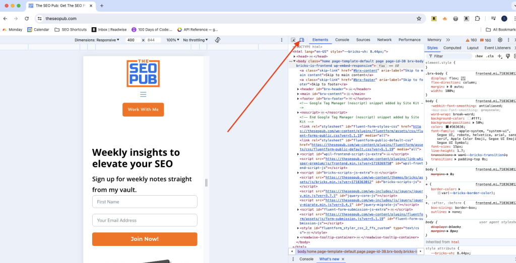
You can certainly pull up your website on a smartphone or tablet to inspect it, but that is not always the most convenient way to do it. Chrome Developer Tools actually has a really simple feature you can use instead.
Just follow these steps inside Chrome or a browser built on Chrome (Edge, Brave, etc.):
- Go to the webpage you want to view.
- Right click on the page and choose “Inspect”.
- Then in the Developer Tools toolbar, you will see an icon that lets you change between desktop and mobile.

Now you can see how the site looks on mobile.
What should you look for on the mobile version?
There are a few routine checks I perform when comparing the desktop and mobile versions of a page.
The first, and most obvious one is to look for any content that is missing from one version to the other. Sometimes web developers get fed up with trying to get something to layout correctly on a mobile version of a page and choose to just hide it instead.
The second thing I always look at are the margins on the left and right of the page and in between paragraphs and sections of the page.
I have often come across both extremes on the left and right margins of mobile pages. I have seen cases where the content runs right to the edge making it harder to read, as well as times when the content was too narrow because the margins were too big. That is an equally horrible user experience.
Is the font size readable? Is it too small or too big?
And lastly, are there any features that are important for conversions that are either missing, not as prominent, or just laid out poorly on the mobile version.
I found an example of this on a site I audited recently where the call to action was part of the menu in the navigation. It was fine on the desktop version, but when you went to the mobile version it was hidden in a hamburger style menu button rather than being immediately visible.
By using this simple feature in Chrome Developer Tools it is easy to audit the mobile version of your webpages.
Watch the video version below:


