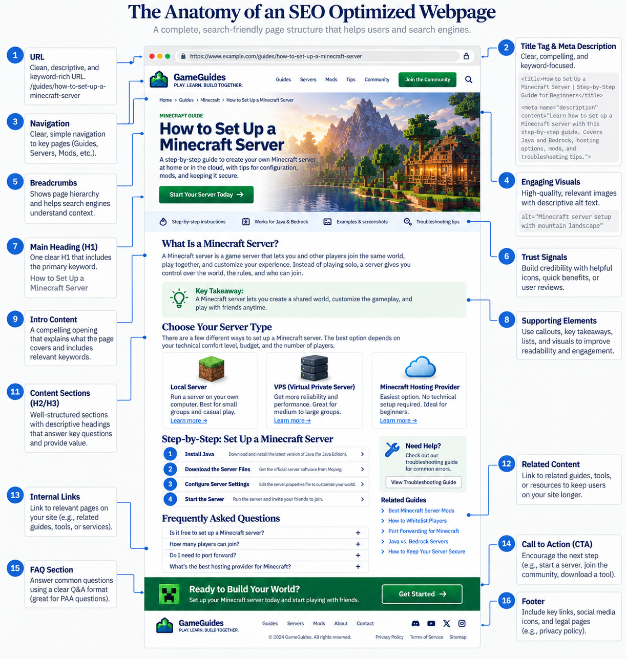
Many years ago, I released a wireframe diagram of what a well-optimized page looks like, complete with badly done arrows drawn with Microsoft Paint that my friend Brianna endlessly made fun of for years after. I hope she’s reading this.
That diagram was hugely popular among people who visited ‘The Pub’ and gave an easy reference guide for people building new pages. At the time, if you followed it, you were probably ahead of 80% of your competition.
I thought it was time for an updated, more visually appealing version.
That diagram is about as complete a map of an optimized page as you will find. Sixteen elements, all of them real, all of them in the right place.
What a diagram like that cannot show you is what each element is for. It points at locations. And on-page work mostly goes wrong not because an element is missing, but because it is doing a job that belongs to something else.
So here is the same page, walked top to bottom, by job. This is the first of two notes. The next one covers the parts of a page that never appear on a diagram at all.
The Three Elements People See Before They Click
The URL, title tag, and meta description are the only parts of your page anybody sees before deciding whether to visit. They are doing a different job from everything else on the diagram, and it is worth treating them as their own group.
The URL is readable identity. It appears in the search result, and when someone pastes a raw link into a forum or a Slack channel, the URL becomes the anchor text. So descriptive and keyword-relevant is genuinely useful, exactly as the diagram says.
The part worth adding: that is advice for pages you are creating. Going back to improve the URLs of pages that already exist is almost always a bad trade. You take on redirect chains, lost equity, and broken external links in exchange for a very small signal. Get it right at creation, then leave it alone.
The title tag has two jobs that pull against each other. It is the strongest single statement on the page about what the page is for, and it is the thing a person reads when deciding whether to click. Those are not always the same sentence.
It is also the element you have the least guaranteed control over, because Google rewrites titles. How often depends on whose study you read. Ahrefs looked at 953,276 top-ten pages and found rewrites 33.4 percent of the time. Zyppy analyzed more than 80,000 titles across 2,370 sites and found Google changed at least part of the title 61.6 percent of the time. A study from early 2025 put it at 76 percent. Different methods, same direction: a large share of the time, what you wrote is not what appears.
There is one reliable lever, and it is the most useful thing in this note. Zyppy found that when the title and the H1 say roughly the same thing, the rewrite rate dropped to about 20.6 percent. That is the cheapest hedge available and almost nobody does it on purpose.
The meta description is a click lever, not a ranking lever. It has not been a ranking factor for a very long time.
That does not mean keywords in it are pointless. Google bolds words in the snippet that match what the person searched, so including the terms people actually use makes your listing visibly more relevant at a glance. You are writing for the bolding, not for a ranking signal. Same words, completely different reason.
Where effort gets wasted here is writing one for every page on a large site regardless of whether anyone will ever see it. Write good ones where the click matters.
The First Few Seconds After the Click
Someone arrives. They decide within a couple of seconds whether they are in the right place. Four elements on the diagram do that work.
The H1 confirms they landed correctly. That is its main job, and it is written for the person who already clicked, not the person deciding to.
Its second job is the one almost nobody uses: the H1 is your anti-rewrite hedge for the title. That is the Zyppy finding above. If the two say roughly the same thing, Google is much less likely to substitute its own.
Worth knowing on the side: Google has said several times that a page will rank fine with no H1, one H1, or five. So the audit tool flagging multiple H1s as critical is enforcing a convention, not a rule. There is still a practical reason to keep one clear H1, and it is the title alignment, not the tool.
The opening should answer the question, or say plainly what the page delivers. Using the words they searched is good practice and happens naturally when you answer directly, because the question contains those words. What does not work is spending the first paragraph explaining what the page will cover. That is where the back button gets pressed.
Trust signals exist because every doubt you leave unanswered is a reason to go check somewhere else. A byline, a last-updated date, a line about how the thing was tested. Small, and they cost nothing.
Navigation and breadcrumbs answer where am I and what else is here. Breadcrumbs place the page in a hierarchy, which orients the reader and gives structure to everything parsing the page. Navigation gives crawlers a path. If a page matters, it should be reachable without an XML sitemap.
The Body
Section headings are the outline of the argument, not a keyword placement exercise. The test I use: read only the H2s, in order, and see whether you get the shape of the answer. If they read like a table of contents for a coherent argument, they are doing their job.
There is a second reason this matters more than it used to. Retrieval systems work on passages rather than whole pages. Headings are one of the clearest signals of where one idea stops and the next starts, which makes a page easier to break into sensible pieces.
Supporting elements are callouts, key takeaways, and lists. Their job is letting someone find their specific answer without reading every word. A wall of text gets abandoned even when the answer is sitting inside it.
Images and alt text. Alt text is what a screen reader announces in place of the image. That is the purpose, and it happens to help Google understand images too. Accessibility first, image search second, keyword slot never.
Where They Go Next
Internal links are the one element on the whole diagram you control completely. Google uses anchor text to understand what a linked page is about, and you cannot control what other sites say when they link to you. You control every internal link on your own site, and most sites throw that away on “click here” and “learn more.”
Related content is worth doing deliberately or not at all. An auto-populated block of your latest posts is clutter. Three or four next steps picked specifically for that page, aimed at where the reader actually is, is guidance. If you are not going to curate it per page, the empty space is better.
The FAQ section answers the follow-up questions so nobody goes back to search for them. It suits People Also Ask particularly well, since both are question-shaped.
One thing to know if you are adding one for the markup: the FAQ rich result itself has been deprecated. The section still earns its place, just for the reader and the follow-up questions rather than for a rich result.
The call to action is the next step, offered after the value rather than in front of it. The same content in a modal that fires before anyone has read a sentence is a reason to leave.
The Point
Nothing on that diagram is new, and nothing on it is going away. The mistakes are mostly about assignment. Effort spent on the meta description as a ranking lever. Effort spent rewriting URLs that were fine. Effort spent on alt text as a keyword field. And almost no effort on the internal anchor text that actually carries meaning.
Next note: the parts of a page that no diagram can show you, because they do not have a location.