This is something that I think people often overlook and do not pay enough attention to.
Your goal in setting up your site’s internal link structure is to control the flow of link equity throughout your site. Think of your internal link structure like a water irrigation system. You want to control the flow of water to make sure your most important crops (pages) are being taken care of.
Now the amount of PageRank, link equity, and authority that a page can pass on is divided up among the links on the page. Meaning that every link that gets added to a page, the less link equity that will flow through each individual link.
If you have a page passing on LE amount of link equity and there are 4 links on that page with all things being equal, each link is going to pass on .25LE link equity (1/4 x LE). (I know all things among links are not equal. As I just discussed above, link location plays a big role. Let’s just make it simple for this example though.) If you add another link to this page so that there are now 5 links on the page, each link is going to pass .20LE link equity (1/5 x LE).
(Yes, this is a really simplified explanation to get the point across and keep the math simple.)
Going back to the irrigation system analogy, you can visualize the links leading off of a page as a hose and the water it is carrying as the link equity being passed on by the links.
Without changing anything else, if you split that hose off at the end into 7 other hoses leading to other parts of the field, those individual hoses will have a greater amount of water flowing through each of them than if you had split it off into 10 individual hoses.

If you keep adding more hoses, the water pressure will keep decreasing through each individual hose.
Doing the opposite, removing additional hoses, will cause the water pressure and amount of water flowing through each hose in increase.
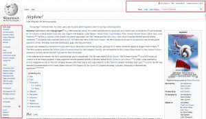
In general, you want to limit the number of links that appear on your pages. Most sites do not have the enormous amounts of link equity flowing into their domains that a site like say a Wikipedia does to play around with. They can afford to have 100+ links at the end of their pages and the 15-30+ links you often find inside their content.
Eliminate any unnecessary links. Every link that appears on a page is weakening the strength of the other links on the page. The fewer links, the stronger each link will be. This is obviously important for maximizing your internal link structure.
Your internal links have two jobs.
- To assist your users to find what they are looking for.
- To funnel link equity where you want it to go.
If you start creating internal links (or external links for that matter) carelessly, you are diluting the flow of link equity. Make sure each link has a purpose. Do not link to a page just to link to a page.
Ask yourself two questions before creating a link. Is there a good reason that you want to direct users to that page? Is there a reason that you want link equity to go to that page?
If you answer no to both of those questions, there is no purpose to creating the link.
When I take on a new client or do audits for websites, one of the first things I like to do is look for ‘wasted’ links. I most commonly find these in headers and footers of the site’s template.
I will see things like Contact Us and About pages duplicated in the header and the footer. There is an argument to be made that maybe that is good for the user experience. Maybe. I think most web surfers at this point in the life cycle of the internet are trained to know that if they don’t find a Contact Us or About page in the header, they will likely find it in the footer, and vice-versa.
The argument becomes even more moot when the site is using a sticky header where the navigation follows the user all the way down to the bottom of the site.
If you are concerned about removing these links from one of those locations, set up some tracking for a few weeks and see how many visitors are actually clicking the links in each location.
I often also see social media links duplicated in the header and the footer. Completely useless. Pick one. You don’t need both.
More common places I find links that can be removed or condensed:
- Recent blog posts featured on home page
- This is another one that an argument could be made it has value in the user experience. Also, maybe your site would be just fine without and it.
- Breadcrumb links
- If a site is under a fifty thousand pages or so, I rarely find that these are really that useful to users, or search engines.
- Multiple links grouped together all going to the same place
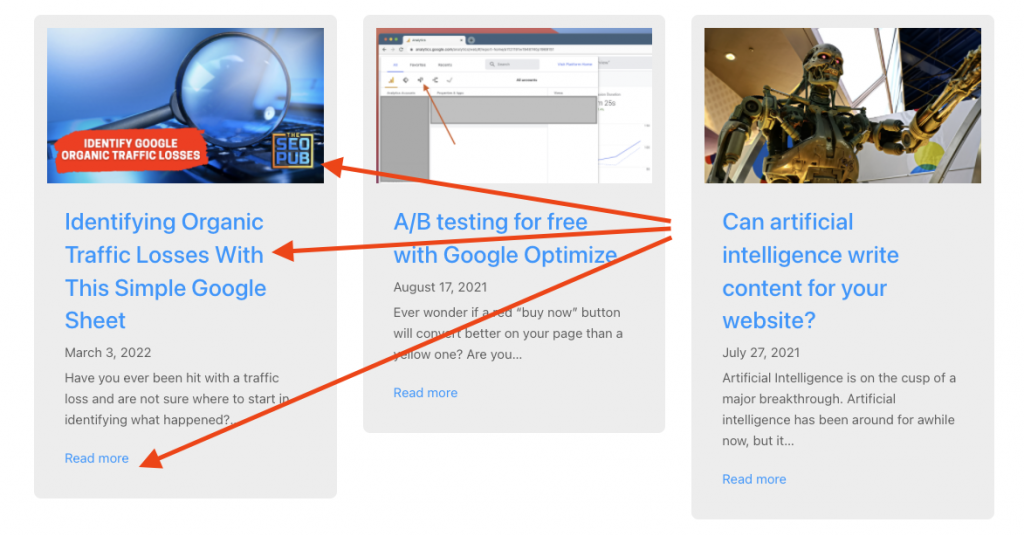
- I see this a lot on blog archives and category pages. Each post will have a box devoted to it with an image, the post title, an excerpt, and some sort of “read more” type link. The image, the title, and the read more link will all be individual links leading to the same place. Instead you can make the whole box a link or just pick one of them to link to the post. The same thing happens a lot on ecommerce sites on their product listings.

Cut Down on Waste
I know what some people are thinking.
But Mike, look at all those links that a site like Amazon has in their footer?
You are right, and when you develop a site with as much authority as Amazon, you can do pretty much whatever you want.
Trim up the excess fat on your site. Remove unnecessary and unneeded links that are appearing across the majority of your webpages, and you will funnel more link equity towards the pages that are important to you.
Again, think of it like an irrigation system.


